WITRON’s Software Interface Offensive
26th July 2024

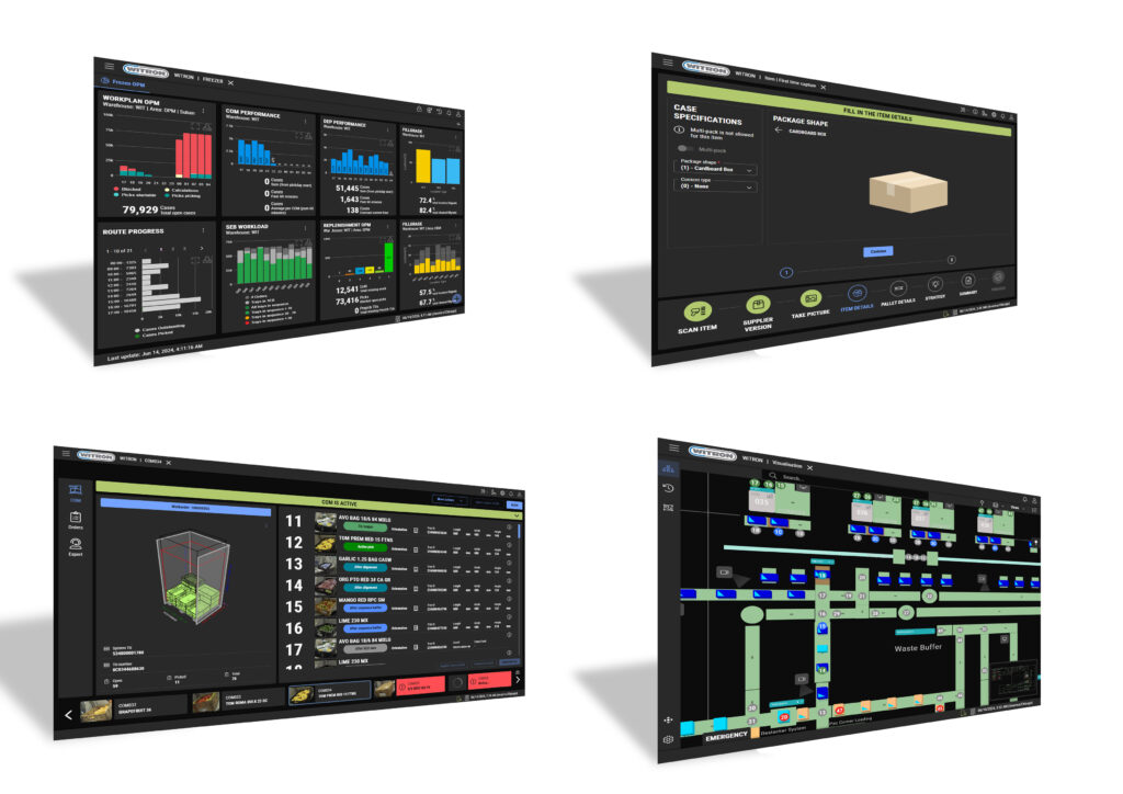
A new generation of software interfaces is moving into logistics centres. A few months ago, WITRON launched its interface offensive – architecturally, in the UX process, and in visualization.
WITRON designs, implements, and operates highly dynamic distribution centres for retailers in Europe, North America, and Australia. Although the cost-efficiency and output of an overall system are, of course, always of primary importance, software Events interfaces are often the ‘moment of truth’ in a customer relationship for Dr. Stefan Bauer. For several years, he has been responsible for the software interface change project at the internationally successful family enterprise from Parkstein in Bavaria, Germany.
“With the interfaces, the customer experiences how user-friendly the software finally is”, explains Bauer who has taken WITRON’s interfaces to a new level together with his team. The task for him and his team was to establish browser-based applications in the WITRON system world. A big step for the intralogistics specialist. “We were increasingly faced with customer requests to address this topic. Software is changing. The demands from the consumer world are high. Customer requirements are also changing in terms of interfaces. Office products are no longer the benchmark. Mobile applications and web technologies are the standard.
“We can scale the interfaces dynamically and also offer the corresponding modern hosting options from On-Premise, Data-Center to Hyperscaler. And today in particular, this is an expectation that is very important, even for warehouse software”, explains Bauer. “Because state-of-the-art user software is defined by a wide range of criteria: a high level of functionality, stability, clarity, simplicity, performance, customized for the respective user in their specific work area.”
Pilot project: Browser-based WMS for customers from the healthcare sector
The Upper Palatinate-based company started from theory into practice with a North American customer from the healthcare sector. “We migrated a complete WMS to a browser-based application, which is being launched at more than 40 sites. Browser-based interfaces support different protocols on all end devices”, says Stefan Bauer. The transition to browser-based interfaces was complex and required close cooperation with technology partners such as Microsoft and Oracle. “We have not only adapted and enhanced our own framework such as MIS, but also re-designed the workstation dialogs”, emphasized Stefan Bauer.
New developer generation
The team implemented new tools based on a JavaScript program library to allow the development of flexible and scalable interfaces. The application is intuitive and always allows quick adjustments. WITRON uses this technology also for workstation dialogs. The application, a modern IT environment, is designed to make workplaces more attractive – for WITRON’s and the customers’ employees. A decisive differentiating criterion in today’s work environment. “In this project, we involve young developers, experienced web developers, and senior developers who have internalized the business processes. The result speaks for itself, a completely new dialog world that customers are familiar with from their daily business.” Bauer’s goal: An individualized customer interface without having to upgrade the hardware behind it.

Roadmap as the basis for further development
However, the change process for WITRON does not end with the completion and acceptance of the new software. “Another important step is software maintenance and permanent enhancement in close cooperation with the customer”, says Bauer. “The software maintenance process is defined on the basis of a service contract and implemented with the customer using a roadmap.”
While Bauer and his colleagues are responsible for the architecture, Dominik Simbeck makes the interfaces ‘pretty’. Simbeck grimaces. He doesn’t want to leave it at that. “User experience and usability is more than just applying corporate CI colors to the HMI. It’s not about making it look pretty, it’s more about efficiency and avoiding complexity”, he emphasizes. In recent months, he and his team have established a UX process in the company. The process is based on a classic design thinking approach. The goal is to identify user needs at an early stage and optimize processes accordingly. This begins with the theoretical design of the processes, followed by the creation of wireframes and iterative tests with end users. The process leads to the development of a UI prototype, which is then transmitted to the software developers. This approach allows to continuously improve the user interfaces and adapt them to the users’ needs. The migration to browser-based interfaces also required organizational adjustments at WITRON. A specialized UX team was formed to focus exclusively on optimizing the user experience. A consistent design system was introduced to ensure the quality and consistency of the interfaces. These measures do not only facilitate the development of new applications, but also improve the maintainability and enhancement of existing systems – both technologically and functionally
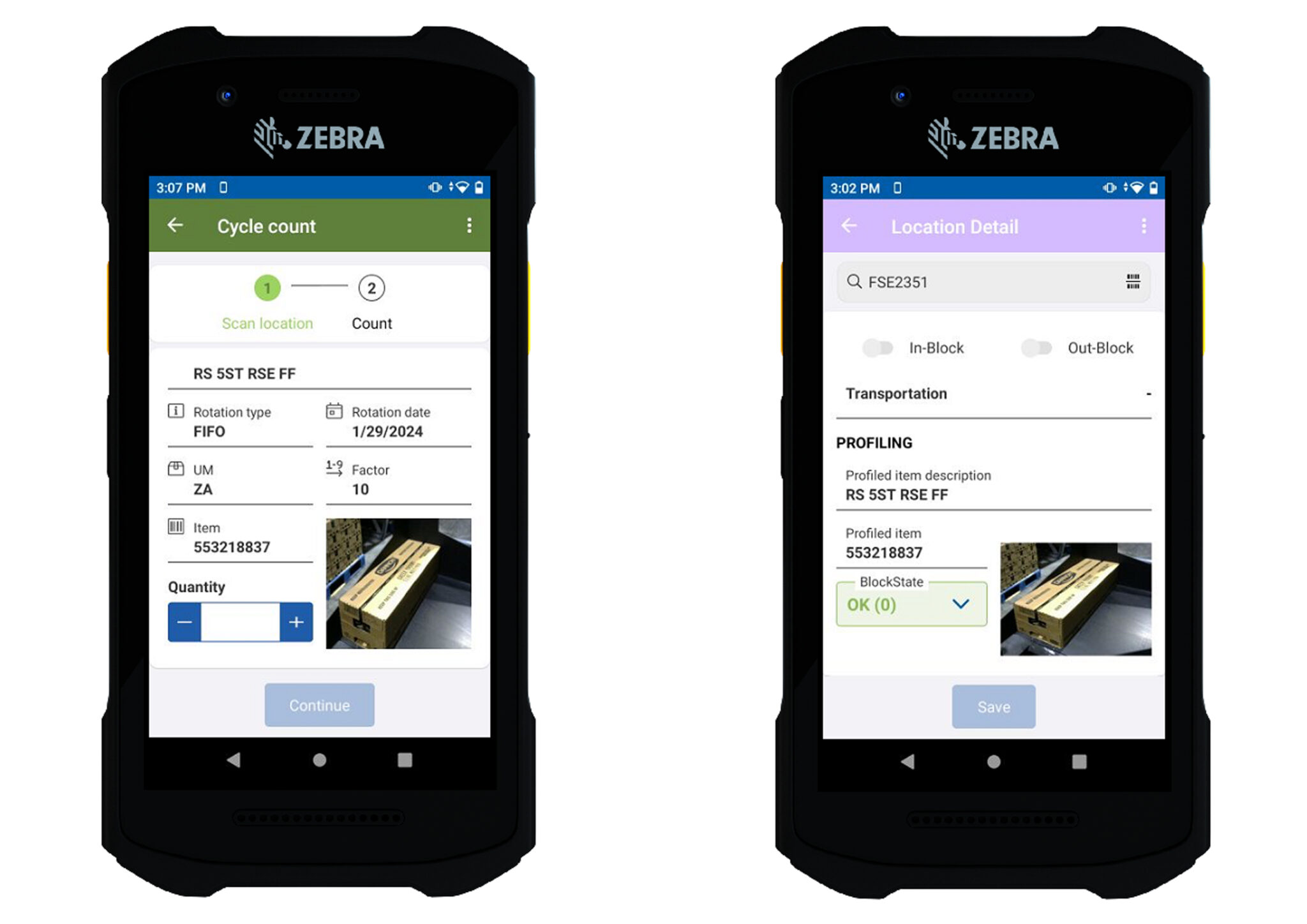
“Requirements change, there are new innovations from WITRON, and also the customer business changes. So, we have to keep pace with that. That’s why the UX topic is now also part of the production development process and a key driver behind the UI development. UX and user interface design in the industry sector is different to the consumer market”, emphasizes the specialist. One of the major challenges is adapting UX strategies to the specific requirements of industrial environments. For example, touch panels used in the frozen food environment at minus 26 degrees Celsius must also be operable with gloves and therefore require a different design than typical consumer tablets. The colour schemes and contrasts must also be adapted to the lighting conditions in warehouses.
Process stability and costs
The most important project for Dominik Simbeck’s team in recent months was the migration of the WITRON Warehouse Management System to a browser-based application as part of a project for a North American food retailer. This migration was not only driven by technology, but also offered the opportunity to fundamentally revise and optimize the user interfaces. “We were able to integrate user feedback directly into the optimization process. This approach enables us to identify specific potential for improvement, particularly in the area of data maintenance and master data registration.” Close cooperation with customers is an essential part of the UX process at WITRON. Dominik Simbeck’s team sent UX experts to customers to monitor and analyze current workflows and user interactions. “Specific pain points are identified through interviews and direct monitoring. This information flows into the optimization of the user interfaces to ensure intuitive and efficient use”, explains Dominik Simbeck. The customer was delighted. “Our team received a thank you letter from the employees, which doesn’t happen very often in the UX sector.”
And how does he measure the success of a good UX? “At WITRON, the success of the user interfaces is evaluated both through subjective user feedback and objective measurements. This involves observing how quickly and effectively the new interfaces are adapted and whether they lead to a reduction in operating errors and support requests.” Dominik Simbeck emphasizes that a good UX process has numerous advantages – for the customer and for WITRON. “The higher process stability in the system results in better availability, more efficiency, and higher output. The result is a reduction in hardware costs, a lower need for service staff, and considerable time savings – and last but not least – it creates attractive jobs for logistics employees.”
read more
User Experience Vital in 2020 Fulfilment, Says WMS Specialist

